
The chart below shows the value of one country’s exports in various categories during 2015 and 2016. The table shows the percentage change in each category of exports in 2016 compared with 2015.
Summarize the information by selecting and reporting the main features, and make comparisons where relevant.
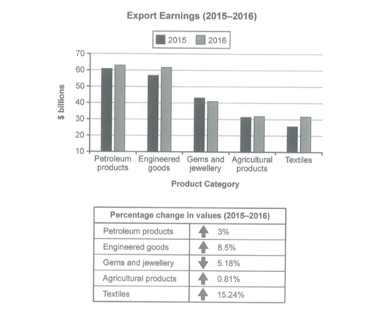
The bar graph delineates the export earnings of a country in billion dollars in different categories, in 2015 and 2016. Τhe table demonstrates the size of the change in percentages in each category from 2015 to 2016.
Overall, the highest earnings were gained by petroleum and engineered products for both years, while each category of exports experienced slight changes in values between those two years.
Particularly, petroleum products export value stood at around 61 billion dollars in 2015 and the next year witnessed a slight growth of 3%, reaching about 64 billion. Meanwhile, engineered goods experienced a greater rise of 8.5% from approximately 58 billion in 2015 to around 62 billion dollars in 2016.

By contrast, gems and jewelry were the only exported goods that saw a decline of 5.18%, reaching the final value of 40 billion dollars in 2016. However, in both years, they were the third most exported products. The most significant change during this period was witnessed by textiles, which rose by 15.24% compared to a 0.81% surge of value in agricultural products. Both categories tied at 31 billion dollars in 2016.
(189 words)