
7 Band Model Answer
The chart shows the percentage of households owned and rented accommodation in England and Wales between 1918 and 2011. Summarise the information by selecting and reporting the main features, and make comparisons where relevant.
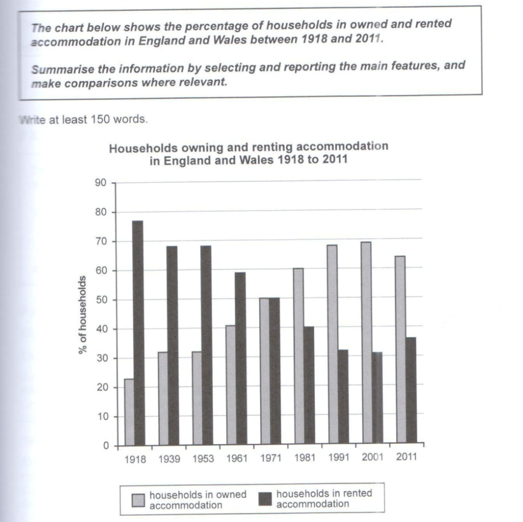
The bar chart compares the proportion of households owning and renting accommodation in England and Wales from 1918 to 2011.
As can be seen clearly, there is an upward trend in households that are owned accommodation, as opposed to rented houses that presented a gradual decline.
In particular, in 1918, there was a big difference between the two categories, with owned houses to stand at just under a quarter and rented accommodation to reach a high of almost 76%. Furthermore, the proportion of owned and rented accommodation appeared to remain constant during 1939 and 1953, with approximately 30% and 68% respectively.

In 1961, owned households Stood at 40% and then, they followed a significant increase, reaching a peak of almost 70% in 2001. On the contrary, the houses that were rented, followed an opposite pattern, starting from 68% and falling to 30% in 2001, the less significant feature for this category. Lastly, there was a small rebound at the last year, with rented houses rising to nearly 40% and owned houses representing just over 60%.
178words.