
Band 7 Model Answer
The Graph below shows average carbon dioxide (CO2) emissions per person in the United Kingdom, Sweden, Italy and Portugal between 1967 and 2007.
Summarise the information by selecting and reporting the main features, and make comparisons where relevant.
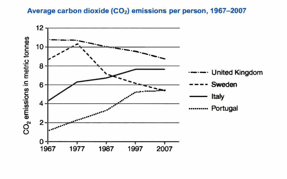
The line graph delineates the carbon dioxide in metric tonnes that a person emits in four European countries, from 1967 to 2007, decade upon decade.
Overall, Italy and Portugal witnessed an upward trend during the forty-year period in carbon dioxide emissions. Whereas Sweden and the United Kingdom predominantly saw a decline for the same period.

Particularly, the United Kingdom presented the highest figures of emissions per person during the forty years; in 1967 the CO2 emissions were just below 11 metric tonnes. However, the next years followed a gradual decrease, reaching at around 8 metric tonnes of emissions in 2007. Simultaneously, the emissions of carbon dioxide per person in Sweden started at just above eight metric tonnes in 1967, but in the next decade. It reached its peak at just over 10, and from 1977. It witnessed a downward trend, hitting a low of just beneath 6 metric tonnes in 2007.
On the other hand, Italy’s and Portugal’s emissions per individual began from around 4 and 1 metric tonnes, respectively. Subsequently, both countries saw an upward trend, with Italy’s emissions peaking at just under 8 metric tonnes and Portugal’s at around 5 in 1997 and remained constant until 2007.
(196 words)